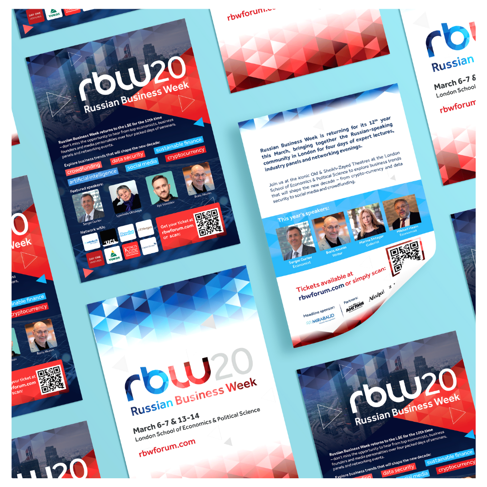
Russian Business Week 2020 logo and brand identity
Russian Business Week is one of London’s most prominent annual social events, attracting hundreds of guests for four days of lectures, expert panels and networking. The conference provides a unique platform to discuss and debate on business, economic, political and cultural topics.
As an established event in it’s 12th year, it was important to keep the familiarity of the previous year’s branding, but still differentiate it for 2020. The client was keen to maintain the use of red, white and blue shades that appear in the Russian flag, but incorporate them into a pattern that could be used on various branded elements to pull everything together. After providing a few options, this tessellating geometric pattern was chosen, providing a contemporary and easily adaptable theme, that still had a professional look that tied in with the event.